Critique
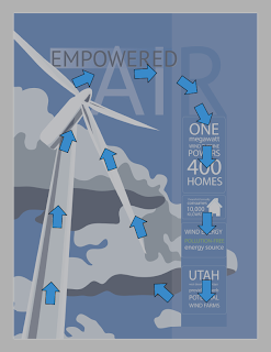
The illustration is solid, and engaging. The message is obviously about windmills being used for power. The typography and use of gradient depict airflow. There doesn't appear to be much room for additional information (if there is going to be any other info). If there is going to be other info I would suggest maybe scaling down the illustration a bit to make more room, or maybe just dropping the opacity a little to allow text to be placed over the top. Overall, it is very strong, and adding research information will only help to make it stronger, given the placement is correct.
Response
I will use the area below the R for all the information about wind turbines and how it pertains to Utah. I do like the idea of moving around the windmill to make space for the info. Also Dropping opacity of the info is another great idea I will explore.

Wind
Power References


